Project type
UI DESIGN | BRAND IDENTITY DESIGN | GRAPHIC DESIGNER
About the project
Aura Medical Clinic is an aesthetic medicine clinic created to enhance natural beauty and promote psychophysical well-being through advanced, non-invasive treatments. The project focused on building a visual identity and digital direction that positions Aura as both professional and approachable — translating medical credibility into a brand system that communicates warmth, trust, and modern elegance.
Background
Project overview
As the Product Designer, my goal was to build a brand that communicates authority, harmony, and accessibility — balancing brand storytelling, user trust, and conversion-oriented design in a category where first impressions strongly influence decision-making.
My contributions included:
Brand Design — From Scratch
Built the complete brand from zero: naming direction, logo system, color palette, typography pairing, and the full graphic language that defines Aura's identity across every surface.
Website Design
Designed a full set of scalable social media templates — posts, stories, and reels covers — extending the brand system into content channels while keeping visual consistency across every format.
Marketing & Communication Design
Designed a full set of scalable social media templates — posts, stories, and reels covers — extending the brand system into content channels while keeping visual consistency across every format.
Website Development
Took the project through to live deployment, building and publishing the website end-to-end using Webflow — handling responsiveness, interactions, and final QA to deliver a production-ready digital presence.
The final design positions Aura as a clinic that offers more than treatments: it offers a safe, modern, and personalised care experience — from the first brand touchpoint to the booking confirmation.
Obstacles
Project Challenges
Challenge 01
Building trust in a sensitive industry
Aesthetic medicine requires a strong perception of professionalism, safety, and expertise. The brand had to reassure users immediately — before they even read a word of copy.
Challenge 02
Avoiding cold clinical aesthetics
While credibility was essential, the visual identity also had to feel welcoming, modern, and human — striking a balance between medical authority and approachable warmth.
Challenge 03
Creating distinction in a saturated market
Many clinics use similar visual codes: beige palettes, generic serif logos, luxury-inspired branding. Aura needed a stronger and more memorable identity to stand apart.
Challenge 04
Designing for emotional decision-making
Users are not only comparing treatments — they are also evaluating whether the clinic feels safe, credible, and aligned with their personal values. The design had to address this emotional layer.
Stack
Toolkit
Research
Design & Prototyping
Collaboration
Methodology
My
Approach
Agile
User-Centric
Data-Driven
I took Aura from zero to live — building the brand, designing the social media system, designing the website, and developing it through to launch. Each phase was informed by the one before it, ensuring the final product was coherent, consistent, and purposeful at every touchpoint.
Phase 1
UX Research
Background
Aura is a digital platform designed for an aesthetic and medical beauty clinic, aiming to present services, expertise, and brand values through a clear and trustworthy online experience.
The project focused on creating a strong brand identity and an intuitive user interface that communicates professionalism, safety, and modern aesthetics. Through UX and visual design, the goal was to build user trust, clearly present treatment information, and guide visitors smoothly toward contacting the clinic or requesting services.
Research Goals
The research aimed to identify how a clinic website can:
- Build trust quickly
- Communicate professionalism without feeling cold
- Make treatment information easy to understand
- Support consultation inquiries through a clear user journey
- Reflect a premium but accessible brand experience
Methodologies
Secondary Research
What do I already know?
- Trust is built through visual credibility and warm tone of voice
- First impressions on clinic sites heavily influence booking intent
- Users need clear, jargon-free service information
- Mobile experience is critical for aesthetic clinics
- Social proof (reviews, before/after) drives conversion
What do I not know?
- Which visual tone users associate with safety vs. luxury
- How users navigate treatment pages and make comparisons
- What level of clinical detail is reassuring vs. overwhelming
- How different demographic groups respond to green vs. neutral palettes
What does success look like?
- Users feel reassured and confident within seconds of landing on the site
- The booking/inquiry journey is clear and frictionless
- Brand feels both professional and human — not cold or generic
- Identity is distinctive and consistent across all touchpoints
User Personas
Persona #1

Giulia Rossi
Age: 34
Education: Bachelor's Degree in Marketing
Occupation: Marketing Manager
Bio
Giulia lives in Rome and works in a fast-paced corporate environment where appearance and confidence play an important role in professional interactions. She is interested in aesthetic treatments that help her maintain a fresh and natural look without drastic changes. However, she is cautious when choosing clinics and prefers places that communicate professionalism, transparency, and medical expertise.
“I want subtle improvements that make me feel confident, but I need to trust the clinic before I even think about booking.”
Goals
- Improve appearance in a natural, subtle way
- Choose a clinic she can trust professionally
- Clearly understand treatments before committing
- Book a consultation with confidence
Frustrations
- Many clinics look overly commercial or superficial
- Treatment information is often unclear or too technical
- Lack of visible proof of medical expertise
Persona #2

Chiara Bianchi
Age: 29
Education: Master's Degree in Psychology
Occupation: Yoga Instructor & Wellness Coach
Bio
Chiara lives in Roma and works in the wellness industry, where she values balance, self-care, and authenticity. She is interested in aesthetic treatments that align with her philosophy of natural well-being and self-confidence. Instead of dramatic transformations, she prefers gentle treatments that enhance her natural features and support her overall sense of self-care.
“Beauty for me is about feeling balanced and confident, not changing who I am.”
Goals
- Find a clinic aligned with a holistic view of beauty
- Feel comfortable and supported during the decision process
- Choose treatments that enhance natural features
Frustrations
- Many beauty brands promote unrealistic beauty standards
- Clinical environments can feel cold or intimidating
- She prefers guidance rather than sales pressure
Project Goals
The project was guided by three interconnected goal layers — brand, UX, and business — each directly informing design decisions for the Aura identity system.
Brand Goals
- Build a recognisable and trustworthy clinic identity
- Communicate professionalism and innovation
- Create distinction in the aesthetic medicine market
- Express care, authenticity, and reliability
UX Goals
- Improve clarity of information architecture
- Reduce emotional friction in the booking journey
- Create a calm and intuitive digital experience
- Support consultation inquiries through trust-centred design
Business Goals
- Strengthen brand credibility and awareness
- Increase qualified consultation inquiries
- Improve user confidence before contact
- Create a scalable foundation for future digital growth
Phase 2
Branding Designs
Logo Concept
Pictogram
The pictogram combines a stylised flower (representing care, well-being, and natural beauty) with the letter A referencing the brand name Aura — merged into a harmonious visual mark that feels soft, iconic, and distinctive.
Curves and proportions based on geometric logic inspired by the Pythagorean theorem — giving the logo a sense of balance, structure, and refinement.
Logotype
The logotype consists of Aura in Mrigny Bold with Medical Clinic as a secondary line in a lighter style. This hierarchy makes the logo feel authoritative, elegant, readable, and contemporary — with a refined typographic structure.
Color Strategy
#073B3A
Primary Dark Green
rgb(7, 59, 58)
- Professionalism
- Trust
- Stability
- Calm
- Authority
#6C9A8B
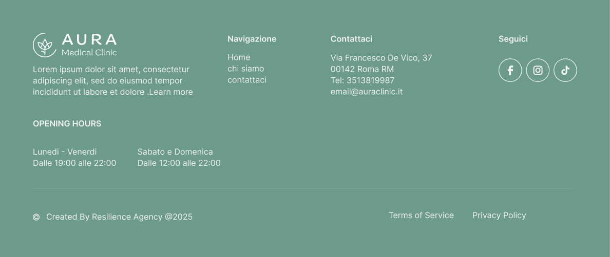
Secondary Sage Green
rgb(108, 154, 139)
- Balance
- Care
- Natural elegance
- Accessibility
#F8F7FF
Light Neutral
rgb(248, 247, 255)
- Transparency
- Gentleness
- Spacious visuals
- Modern vibe
Together, the palette creates a visual balance between medical reliability and natural serenity — supporting Aura's positioning as a clinic that is advanced and professional, but never intimidating.
Typography Strategy
DM Serif Display
Aura
High-contrast transitional serif for hero titles, campaign headlines, editorial moments, and poster-style applications. Refined details and elegant proportions give a stronger premium and editorial presence.
Marigny
Medical Clinic
Adds warmth and personality across body copy, navigation, and UI elements. Together with DM Serif Display, the pairing supports Aura's tone of voice: accessible, empathetic, modern, and authoritative.
.png)
Phase 3
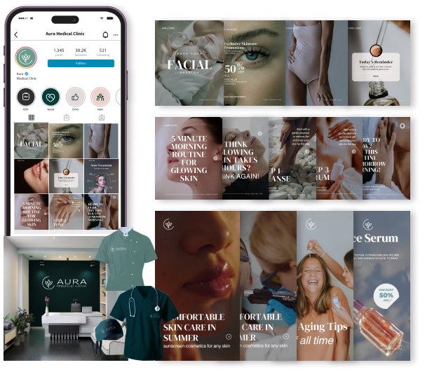
Social Media System
With the brand foundation in place, I translated the identity into a scalable social media template system — designed to give the clinic's content team a consistent, on-brand visual language across every post format.
Marketing Strategy
The visual system was designed to extend consistently across multiple brand touchpoints, both digital and physical — ensuring Aura can maintain a cohesive and recognizable presence in every interaction with its audience.
Phase 4
Website Design
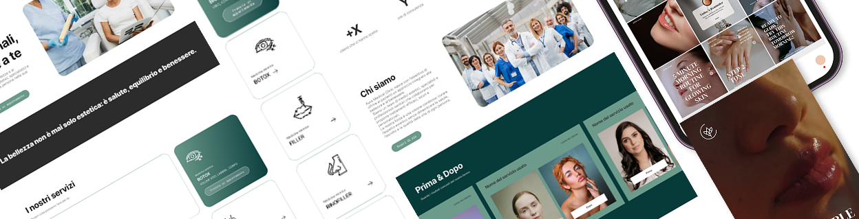
I took the brand into the digital space by designing the full website experience — from information architecture and content hierarchy through to wireframes and high-fidelity UI screens.
Design Tokens & UI Components
The complete token system defined for the Aura website — covering color, typography, spacing, radius, shadow, motion, and all core UI components as implemented.
Aura Medical Clinic — Design System
Atoms — Foundational Design Tokens
| Name | Hex | Token | Role |
|---|---|---|---|
Primary | #073B3A | --color-primary | Trust · Authority · Professionalism |
Secondary | #6C9A8B | --color-secondary | Care · Natural elegance · Balance |
Neutral | #F8F7FF | --color-neutral | Space · Softness · Modern elegance |
Text Dark | #1A1A1A | --color-text-dark | Body text |
Text Muted | #6B7280 | --color-text-muted | Secondary text · Captions |
Surface | #FFFFFF | --color-surface | Card backgrounds · Form fields |
Border | #E5E7EB | --color-border | Dividers · Input borders |
Banner | #073B3A | --color-banner | CTA banner background |
Display · --font-display
Beauty is balance.
Hero · Headlines · Editorial
Body · --font-body
Advanced aesthetic care.
Body · UI · Navigation
| Style | Size · Weight | Token | Sample |
|---|---|---|---|
| Hero | clamp(40px, 6vw, 72px) · 700 | --font-size-hero | Aura Medical Clinic |
| H1 | 48px · 700 | --font-size-h1 | Benvenuti |
| H2 | 32px · 700 | --font-size-h2 | I nostri trattamenti |
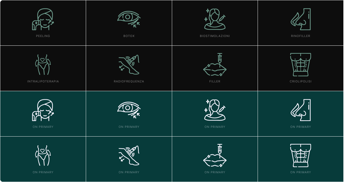
| H3 / UI | 20px · 500 | --font-size-h3 | Biorivitalizzazione |
| Body | 16px · 400 | --font-size-body | Trattamenti non invasivi per il tuo benessere |
| Small | 13px · 400 | --font-size-small | Prenota una consulenza gratuita oggi stesso. |
| Label | 11px · 700 | --font-size-label | TRATTAMENTI · VISO · MEDICINA ESTETICA |
| Token | Value | Visual |
|---|---|---|
| --space-xs | 8px | |
| --space-sm | 16px | |
| --space-md | 24px | |
| --space-lg | 40px | |
| --space-xl | 64px | |
| --space-2xl | 96px | |
| --space-3xl | 128px |
| Token | Value | Usage |
|---|---|---|
| --radius-sm | 6px | Tags · Chips |
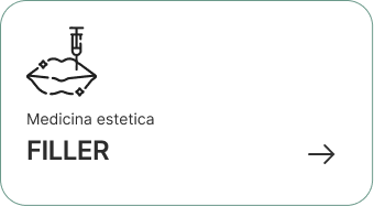
| --radius-md | 12px | Service cards |
| --radius-lg | 20px | CTA buttons · Pills |
| --radius-xl | 24px | Large content cards |
| --radius-full | 9999px | Circular elements |
| Token | Level | Value |
|---|---|---|
| --shadow-card | Card | 0 2px 16px rgba(7,59,58,0.08) |
| --shadow-hover | Hover | 0 8px 32px rgba(7,59,58,0.14) |
| --shadow-modal | Modal | 0 16px 48px rgba(7,59,58,0.18) |
| Token | Value | Label |
|---|---|---|
| --duration-fast | 150ms | Fast |
| --duration-base | 250ms | Base |
| --duration-slow | 400ms | Slow |
| --ease-default | cubic-bezier(0.4, 0, 0.2, 1) | Default |
| --ease-in | cubic-bezier(0.4, 0, 1, 1) | Ease In |
| --ease-out | cubic-bezier(0, 0, 0.2, 1) | Ease Out |
Molecules — UI Component Primitives
Organisms — Assembled UI Sections
.png)
.png)
.png)
“La bellezza è equilibrio. Il nostro impegno è restituirtelo.”
— Aura Medical Clinic
Phase 5
Website Development
I took the project all the way to live deployment — building and launching the website using Webflow, handling responsiveness, interactions, and QA to deliver a production-ready digital presence.
Full Webflow build from the high-fidelity designs — pixel-accurate implementation of layout, type, and color
Responsive breakpoints configured for mobile, tablet, and desktop with no layout degradation
Micro-interactions and scroll animations adding polish without compromising performance
CMS setup for service pages enabling the client team to add and update treatments independently
Cross-browser and cross-device QA to verify consistency before go-live
Live deployment with custom domain connection, SEO metadata, and accessibility fundamentals

Aura website
Live responsive website showcasing Aura Medical Clinic's brand identity, treatment experience, and digital user journey.


