Project type
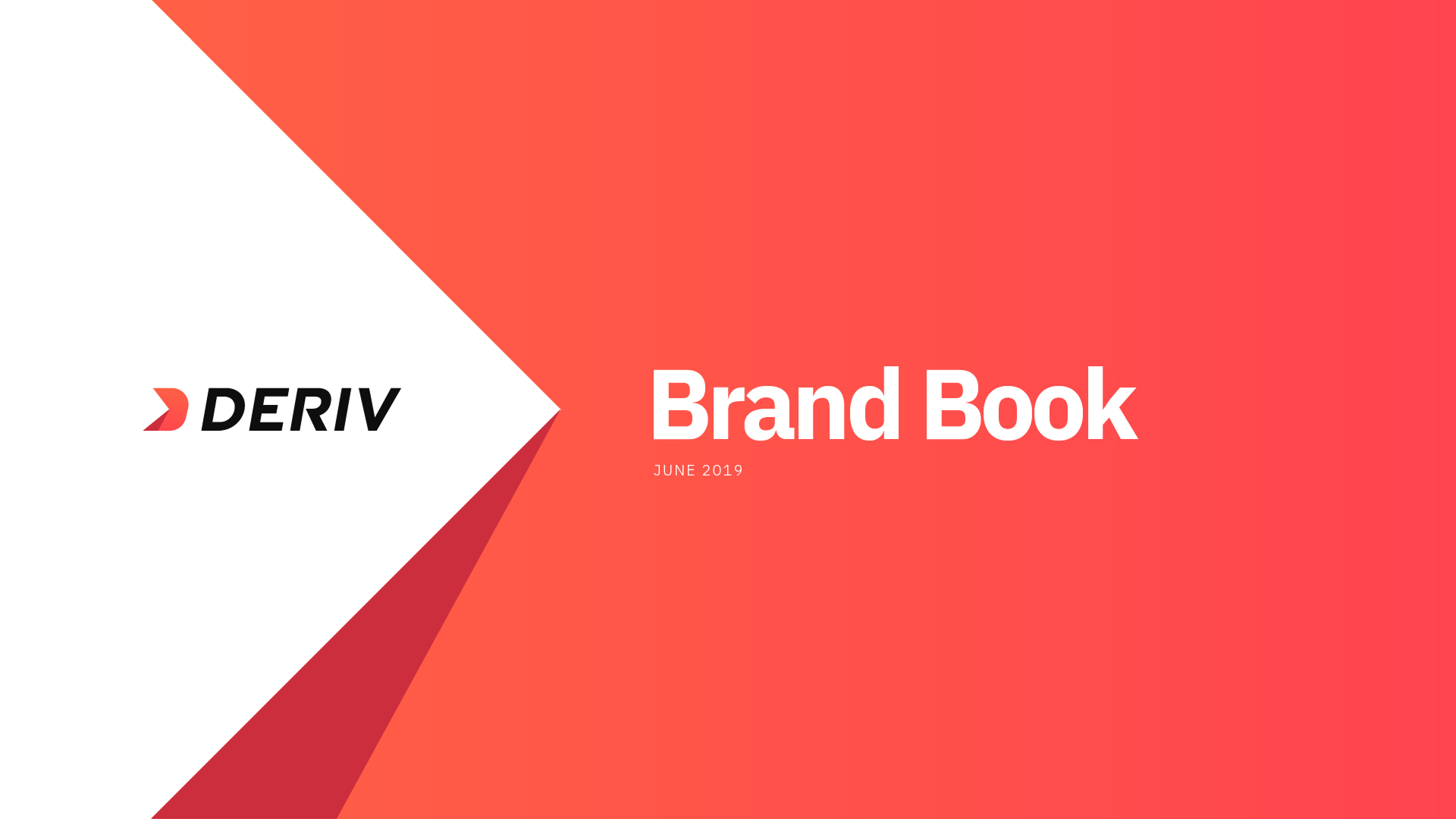
BRAND STRATEGY|VISUAL IDENTITY|PRODUCT DESIGN|DESIGN SYSTEM|MARKETING DESIGN|Product Designer
About the project
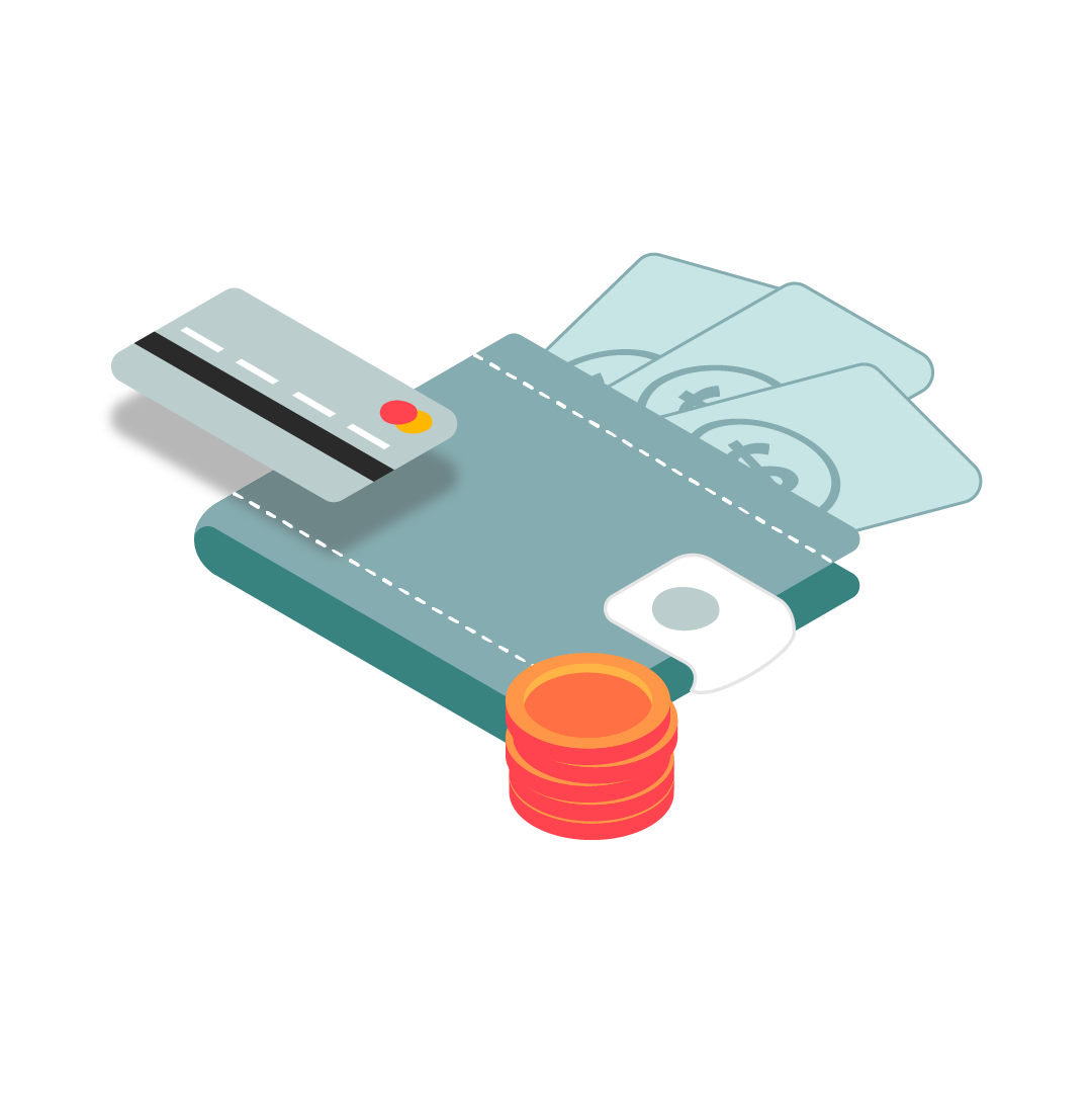
Binary.com, one of the early pioneers in online trading, evolved into Deriv with a bold ambition: modernize the brand, build greater trust, and compete with a new generation of fintech platforms.
As part of a fast-growing multidisciplinary design team, I helped shape the visual and product experience across both brands — building a scalable design language that connected a legacy platform with its sharper, future-ready identity.
Background
Project overview
As a Ninja Designer in a multidisciplinary design team that expanded from 10 to 21 designers during the project, I contributed to multiple aspects of the visual and product experience across both the Binary.com and Deriv platforms.
The goal was to establish a consistent visual language that would scale across the company's products, communications, and platforms — bridging the gap between an established trading brand and its modern, redesigned identity. My contributions included:
Brand System Development
Contributed to the brand book and developed a secondary color palette that complemented Deriv's primary identity. Established a cohesive visual language — covering color tokens, typography, and usage rules — that could scale consistently across a team of 21 designers working across product, marketing, and motion.
Icons and illustrations
Designed a set of icons and illustrations aligned with Deriv's new visual identity — clear, scalable, and consistent in stroke and style. Used across product interfaces, website components, and marketing materials to maintain visual coherence at every touchpoint.
Marketing & Communication Design
Created a variety of marketing assets across multiple channels including email campaigns, social media visuals, and promotional banners. All assets were built on the Deriv visual system, ensuring every communication felt on-brand and consistent — from product announcements to digital ad placements.
Website Design — Home
Designed UI elements and landing page of Deriv platform (Deriv.com) — translating the new brand identity into real product screens while maintaining enough continuity to keep existing users comfortable through the transition.
Through these contributions, I helped establish a unified visual identity across a rebranding at scale — giving a team of 21 designers a shared system to work from, and ensuring that every surface of the product, from the trading platform to social media, spoke the same visual language consistently.
Obstacles
Project Challenges
Challenge 01
Design Consistency Across Teams
Ensuring a cohesive design system across multiple teams working on product, marketing, and motion design simultaneously — requiring ongoing alignment and shared component standards.
Challenge 02
Brand Transition
Managing the transition from Binary.com to Deriv while maintaining familiar UX flows to avoid disrupting a large existing user base accustomed to the original platform.
Challenge 03
Technical & Resource Constraints
Balancing design improvements with development capacity, timelines, and available resources — making strategic decisions about scope and prioritization across a large team.
Stack
Toolkit
Research
 Miro
Miro Zoom
Zoom G sheet
Design & Prototyping
 Sketch
 InVision
 Illustrator
 Photoshop
 Aftereffects
 Lottiefiles
 Premiere
 Figma
FigmaCollaboration
 Zeplin
 Slack
Slack Trello
Methodology
My
Approach
Agile
User-Centric
Data-Driven
I worked within an agile, cross-functional environment — partnering with product, motion, and dev teams to ship features iteratively. My approach blended system-level thinking with rapid prototyping and feedback loops, ensuring every design decision could scale across products and stay anchored to real user needs.
Phase 1
Visual language & guidelines
Identity
Building
the Brand
Before anything could be designed, the brand had to be defined. I contributed to the brand book and developed a secondary color palette — giving every team a shared visual foundation and the flexibility to work across different products and channels without losing coherence.
What I contributed
Contributed to establishing the brand book — the shared foundation of tone, usage rules, and visual identity that made the rebrand possible at scale across a team of 21 designers.
Brand Goals
The brand needed to feel modern, trustworthy, and approachable — a clear step forward from Binary.com while remaining recognisable to its existing audience. The brand book defined:
- Core visual identity and tone of voice
- Color system — primary palette and usage rules
- Typography hierarchy and application guidelines
- Usage rules across digital and print touchpoints
Page 11 / 9
Flexibility without losing coherence
Developed the secondary color palette to extend the brand across digital products and marketing materials — purposeful and cohesive, allowing teams flexibility without diluting the core identity.
Phase 2
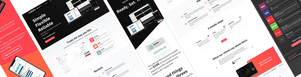
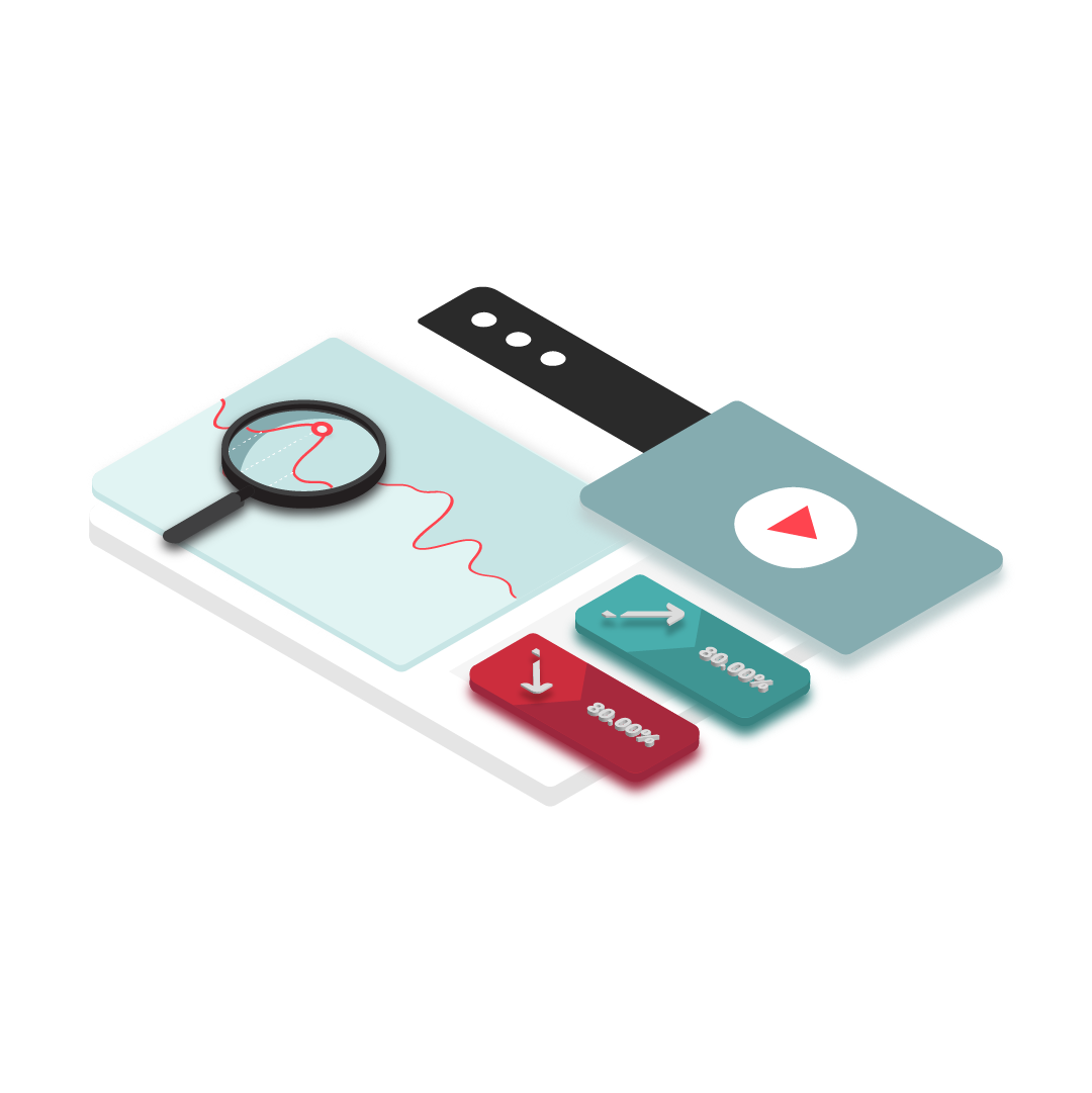
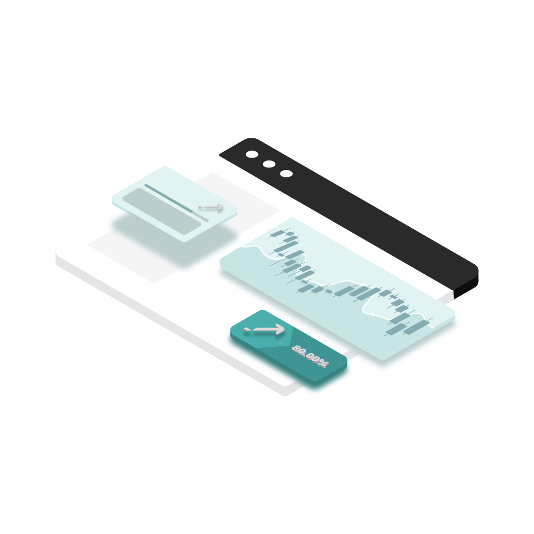
Redesigning the Website
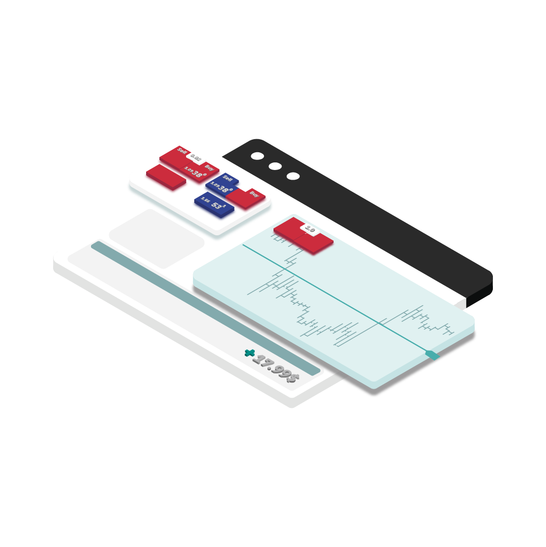
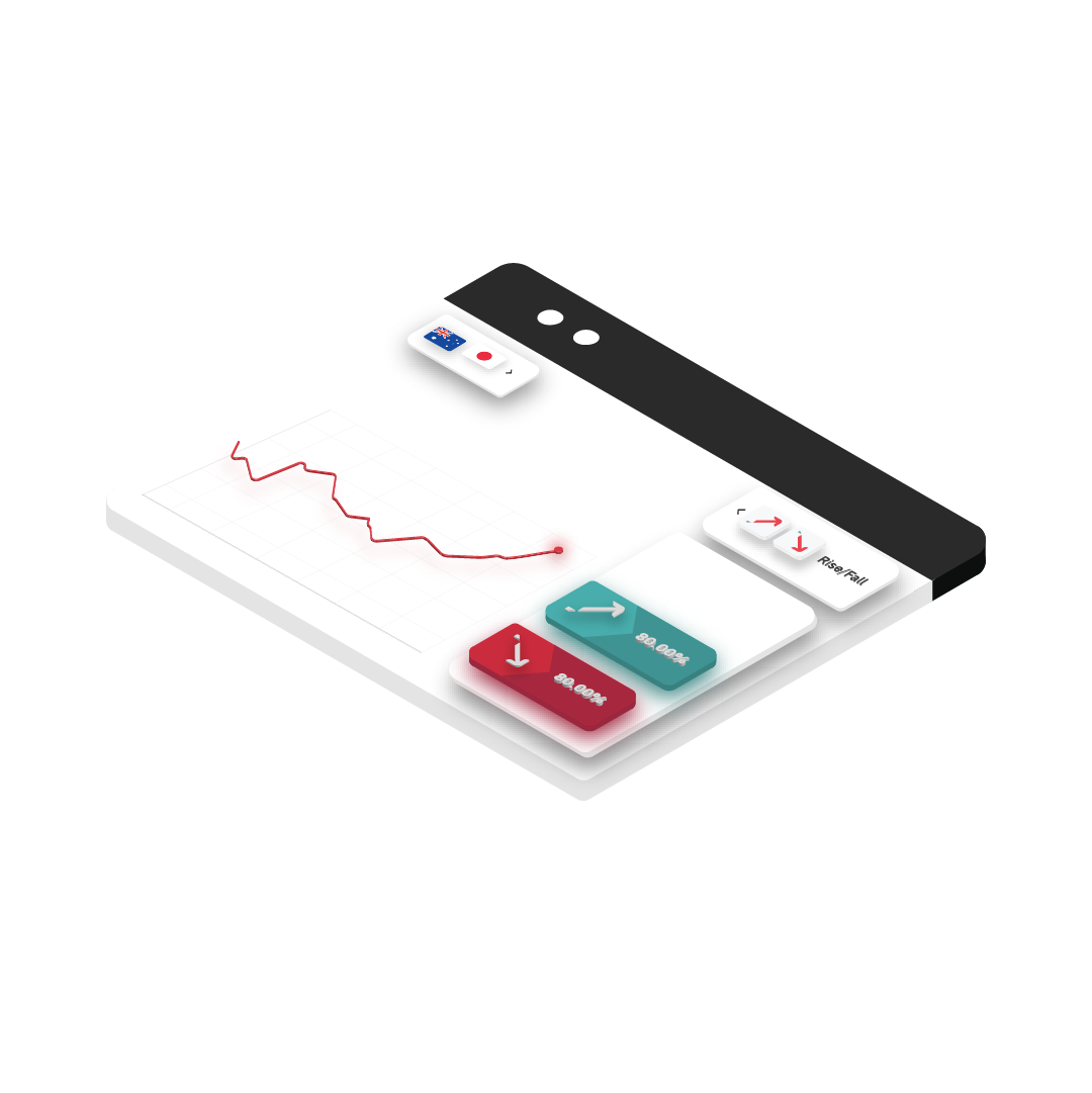
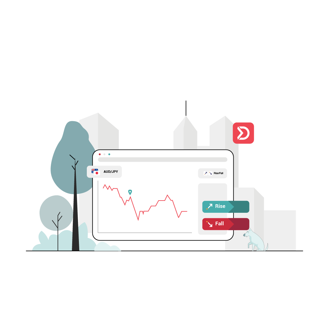
Product
With the brand defined, the work moved to real screens. I designed UI elements for landing pages — translating the new identity into actual product surfaces. The challenge: make Deriv feel modern and trustworthy while giving existing Binary.com users enough continuity to feel at home.
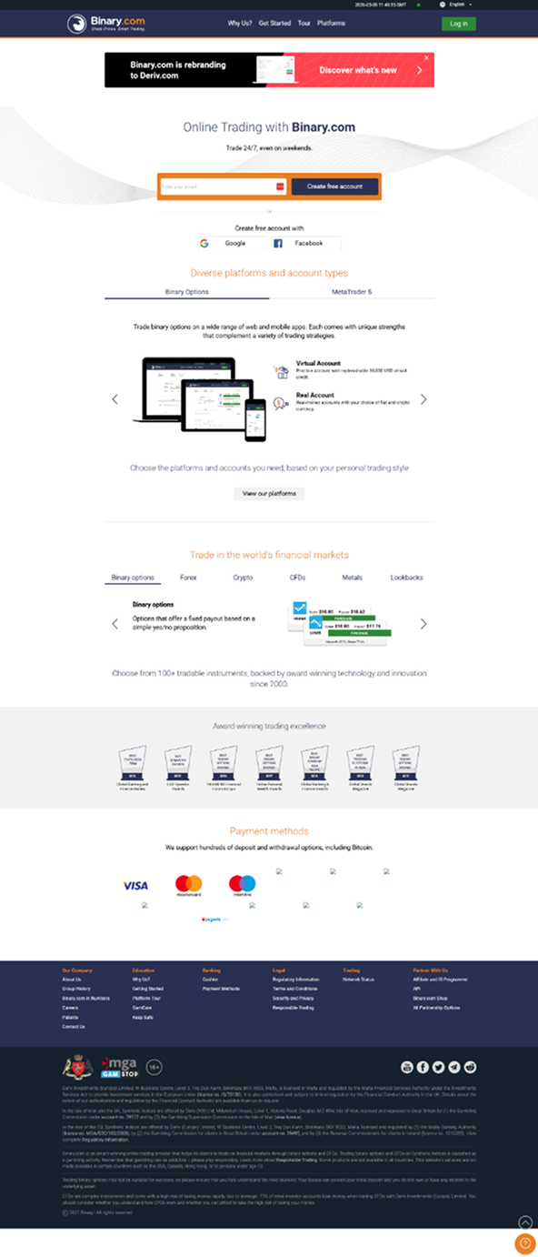
Binary.com
The legacy platform — trusted, but due for a visual overhaul that respected its existing users.
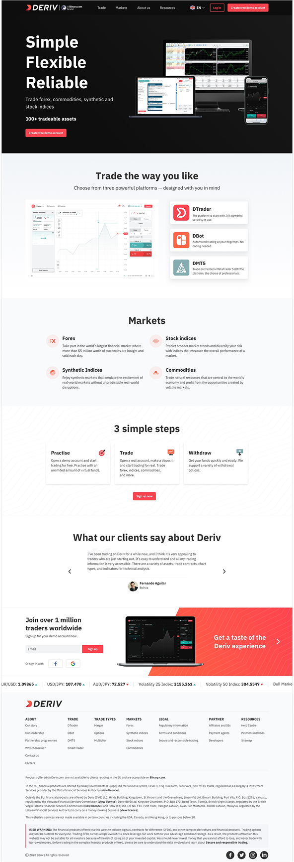
Deriv:
Redesigned homepage with the new identity, clearer messaging, and a modern layout.
Phase 3
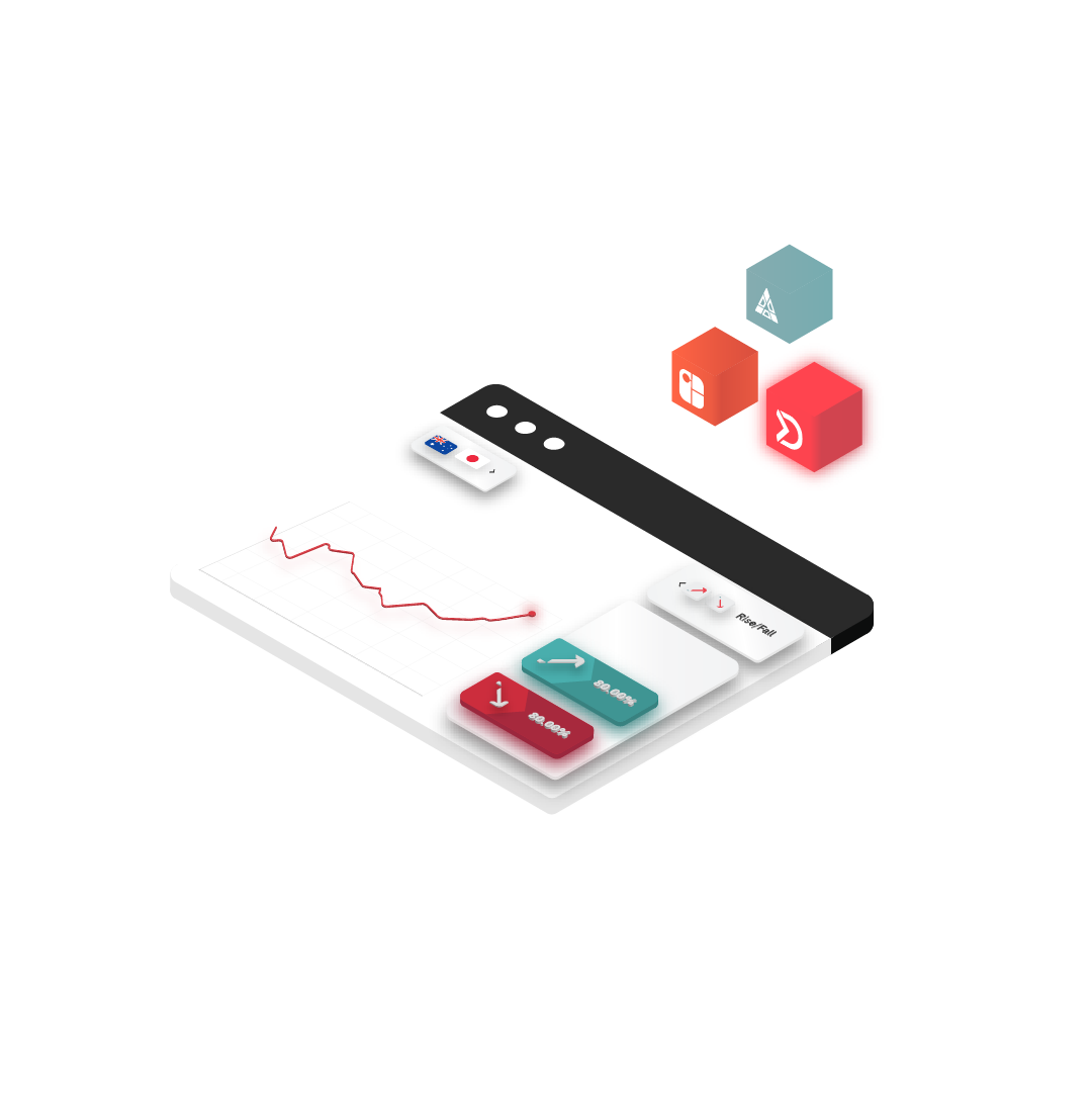
Icons & Illustrations
Visual Assets
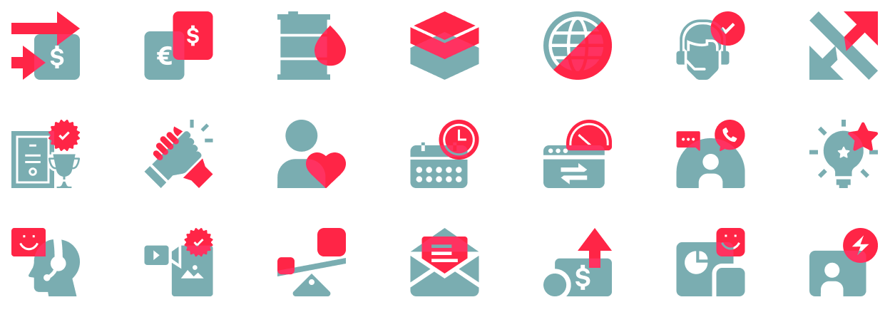
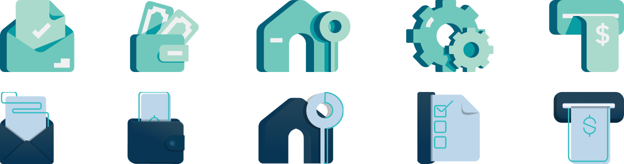
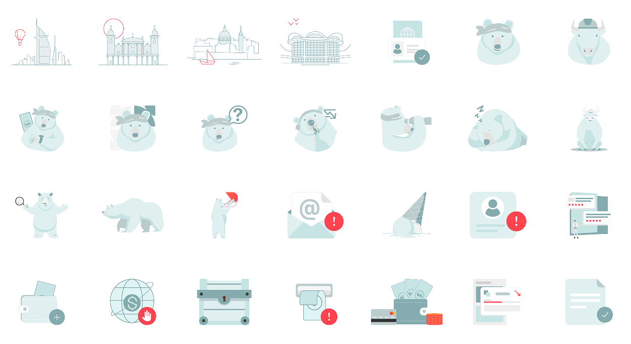
A new brand needs a new visual vocabulary. I designed a set of icons and illustrations aligned with Deriv's identity — clear, scalable, and consistent throughout. They appeared across product interfaces, marketing materials, and website components, tying every touchpoint together visually.
Icon Design Principles
The icons needed to work across a wide range of contexts — from small UI states to large marketing visuals. The design rules were simple but strict:
- Clear and immediately legible at any size
- Consistent stroke weight and corner radius throughout the set
- Aligned with the brand's tone: confident, modern, precise
- Used across product UI, website components, and marketing assets
First version (without secondary palette)
Second version (with secondary palette)
Icon-illustrations
Hero illustrations


Phase 4
The Design System
Foundation
With a brand, a website, and a visual library in place, the next step was making it all reusable. I contributed UI elements and visual components to the design system — helping teams across product and marketing move faster, stay consistent, and close the gap between design and development.
Design System Goals
The system needed to serve a team of 21 designers across product, marketing, and motion — each with different needs but all requiring the same visual output. My contributions focused on:
- UI elements and visual components used across the product ecosystem
- Ensuring consistency between teams and reducing design-dev handoff friction
- Building reusable components for faster product development cycles
Deriv design system — Zeroheight
Token library, component variants, auto-layout patterns — all documented and developer-ready.
Phase 5
Marketing Design
Activation
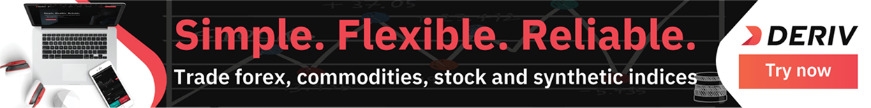
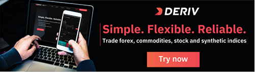
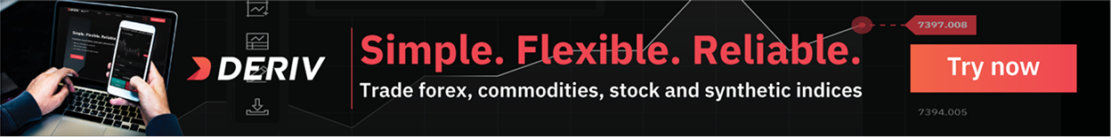
With the design system as the engine, the brand could finally speak consistently across every channel. I created marketing assets that drew directly from the same visual foundation — so that every email, banner, and social post felt unmistakably Deriv.
Social media posts


 1.png)
 1.png)
 1.png)
 2.png)
 1.png)
 1.png)
Ads banners