Project type
UX RESEARCH|UX DESIGN|UI DESIGN|USABILITY TEST|KEY TAKEAWAYS|Product designer
About the project
Safarestan is a travel search agency, which allows travelers to search flight tickets, hotels, trains, insurance and tours.
services and the lowest prices available in the market in the shortest time is the added value that Safarestan brings to users.
Background
Project overview
As a UI/UX designer, my goal was to uncover the primary usability challenges within the Safarestan application and website. Due to the lack of direct access to internal data or real user feedback, the research was conducted using publicly available sources and observable insights.
With the objective of enhancing user experience, increasing customer satisfaction, and ultimately improving adoption and retention rates, I identified several critical areas that require improvement to deliver a smoother and more personalized travel booking journey.
My contributions included:
UX Research & Persona Redefinition
Conducted stakeholder interviews and competitive analysis to surface usability gaps. Redefined the user persona set to more accurately reflect Safarestan's real audience — from first-time bookers to experienced independent travellers.
Website Redesign — Key Screens
Redesigned the homepage/hero, search results page, and confirmation screen, passenger details of the website and application — prioritizing information hierarchy, trust signals, and a cleaner visual structure aligned with the existing brand system.
App UX Improvements
Diagnosed and resolved core usability issues on the mobile app — specifically around search and filter friction and navigation hierarchy. Delivered a full redesigned app flow available as an interactive prototype.
Marketing & Communication Design
Designed scalable social media posts, stories, promotional banners, and short-form video content — extending the Safarestan visual language into marketing channels while maintaining brand consistency.
Through these contributions, I helped reduce usability friction on the platform's highest-traffic screens, reframe the user model driving design decisions, and deliver a redesigned app experience — all within the constraints of a live product with limited developer access.
Obstacles
Project Challenges
Challenge 01
No access to internal user data
Lack of access to Safarestan's internal analytics and real user feedback meant all research had to be conducted through publicly available sources and competitive analysis.
Challenge 02
Developer and budget constraints
Not all layout changes were feasible within the availability of the development team and budget — requiring careful prioritisation of the highest-impact design improvements.
Stack
Toolkit
Research
Design & Prototyping
Collaboration
Methodology
My
Approach
Agile
User-Centric
Data-Driven
I followed an agile, user-centric, and data-driven approach — collaborating closely with the development team throughout the process. My work was guided by user-centered design principles and informed by data-backed insights.
Phase 1
UX Research
Background
Safarestan is an Iranian travel search platform that allows users to compare and book flights, hotels, tours, and travel insurance in one place. The platform aims to simplify travel planning by helping users quickly explore options, compare prices, and complete bookings through a single interface.
The project focused on identifying usability challenges and improving the overall booking experience. Through research and analysis, the goal was to better understand traveler behavior and design a more intuitive, efficient platform for searching, comparing, and booking travel services.
Research Goals
The main objective of this research was to identify usability challenges and opportunities within the Safarestan travel platform and improve the overall booking experience. The research focused on understanding:
- How users search for and compare travel services
- What motivates travelers when planning trips
- Pain points users experience during booking processes
- The expectations users have from modern travel platforms
Methodologies
Secondary Research
What do I already know?
- Users expect travel platforms to provide fast search, clear comparisons, and transparent pricing.
- Many travelers start planning trips through search engines or social media inspiration.
- Platforms that offer multiple travel services in one place (flights, hotels, tours) create more convenience.
- Reviews, recommendations, and ratings strongly influence travel decisions.
- Mobile devices are widely used for searching and booking travel.
What do I not know?
- Which steps in the booking process cause user frustration or drop-offs.
- How users interact with filters, sorting, and comparison tools.
- What factors most influence users when choosing travel options.
- How comfortable different user groups are with online travel booking platforms.
What does success look like?
- Users can quickly search and compare travel options.
- The booking process is clear, simple, and trustworthy.
- Users can complete bookings easily on mobile and desktop.
- The platform helps travelers make confident decisions with helpful guidance and information.
Overview
The research approach combined qualitative research, market analysis, and usability testing to understand traveler behaviors and expectations.
Due to the lack of direct access to internal user data, insights were gathered from public research sources, competitive analysis, and user interviews. These insights informed the creation of personas, user flows, and design strategies aimed at simplifying the travel booking process.
The design process followed an iterative cycle of research, prototyping, testing, and refinement, ensuring that the final experience addressed real user needs and usability challenges.
User Research · Phase 1
Affinity Mapping
After interviews and secondary research, insights were clustered into four core themes.
Cluster 01
Price sensitivity & comparison
“Users want the best price, fast — without second-guessing.”
- Core motivation — value confidence
Users compare across multiple platforms before booking
Price transparency is critical for trust
Hidden fees cause abandonment
Sort & filter tools heavily used
Budget-conscious travellers need clear total cost visibility at every step of the booking flow.
Cluster 02
Search friction & decision fatigue
“Too many options with no clear guidance.”
- Core motivation — clarity & speed
Search results feel overwhelming
Lack of personalised recommendations
Filters are not prominent enough
Users miss best options due to sort defaults
Users with limited travel experience need guided search — not just raw results.
Cluster 03
Trust & credibility signals
“Is this platform safe to book through?”
- Core motivation — safety & assurance
Reviews and ratings drive decisions
Agency credibility unclear on results page
Cancellation policy needs visibility
Secure payment reassurance missing
Older and less tech-savvy users especially need visible trust signals throughout the booking journey.
Cluster 04
Post-booking & trip management
“After I book, I feel lost.”
- Core motivation — control & follow-up
Ticket tracking is unclear
Change / cancellation flow is stressful
No trip preparation guidance
Confirmation emails lack key details
The experience should not end at payment — users need ongoing support and clear post-booking pathways.
Synthesised Findings
Research Findings
Four key insights emerged from the affinity clusters — each directly informing design decisions for the Safarestan platform.
Finding 01
Price confidence drives conversion
Users abandon when total cost is unclear. Transparent pricing with no surprises at checkout is the single biggest trust driver.
Finding 02
Search is the make-or-break moment
Users with limited experience need guided search with smart defaults. Results pages with poor hierarchy cause abandonment within seconds.
Finding 03
Trust signals are underweighted
Agency reviews, secure payment badges, and cancellation clarity are critical — especially for older users and first-time bookers.
Finding 04
Post-booking experience is a gap
Users feel anxious after booking. Clear confirmation, easy change/cancel flows, and trip preparation content are largely absent.
User Personas
Who we're designing for
Based on research insights, two primary personas were defined to guide design decisions — alongside a travel experience spectrum covering three user types.
Limited experience
Relies on recommendations from friends. Starts search on search engines — SEO visibility essential. Needs guidance to compare options. Social proof (reviews/ratings) heavily influences decisions. Inclined to join organized tours.
Moderate experience
Basic trip planning knowledge. Tends to rely on familiar services. Uses social media for destination inspiration. Prefers to quickly identify best options due to time constraints. Values filters and comparison tools.
High experience
Comfortable handling independent travel. Clearly understands trip goals and required resources. Uses platforms mainly for booking, not guidance. Rarely joins guided tours. Motivated by discovering unique destinations.
Persona #1

Sarah
Age: 28
Location: Tehran
occupation : Content producer
Single
Bio
Working professional with moderate income. Prefers short trips due to busy schedule; plans longer international trips with friends during major holidays. Enjoys cafés, online shopping, and sharing travel experiences on social media.
Goals
- Best available prices, bookings completed as quickly as possible
- Easy mobile or tablet purchasing experience
- Compare different travel options and prices before deciding
- Share travel plans, tickets, or tours with friends
Frustrations
- Service matching what was advertised.
- Easy cancellations or changes.
- Weather info for destination.
- Flexibility to attend festivals at preferred times.
Persona #2
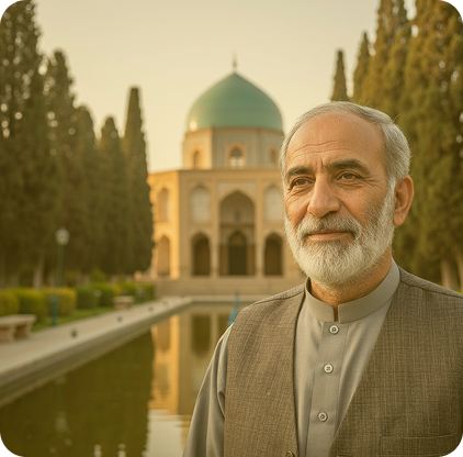
Mohammad Reza
Age: 63
Location: Shiraz
occupation : Retired
Married
Bio
Retired telecoms professional. Loyal to brands that have delivered good experiences. Travels with friends and family. Quality of travel is paramount — he prefers not to travel rather than travel poorly.
Goals
- Comfort in travelling above all else
- Distance between accommodation and attractions clearly shown
- Trusted opinions (not strangers) influencing choices
- Reach destination faster — hates delays and changes
Frustrations
- Registration and login on booking apps is stressful.
- Quick, easy problem resolution when booking issues arise.
- Safe and trackable payment for hotels and travel services.
Phase 2
UX Design
Project Goals
With research complete, the next step was to align business objectives with user needs — mapping shared priorities to drive design decisions.
- Business Goals
What Safarestan needs
01
Increase booking conversion and reduce drop-off
02
Improve user retention and repeat bookings
03
Establish Safarestan as the most trusted travel platform in Iran
04
Expand product range uptake (insurance, tours, trains)
05
Reduce support ticket volume by improving self-service clarity
- Shared
Where both align
✦
Fast, confident access to best-value options
✦
Transparent pricing with no surprises at checkout
✦
Clear, stress-free change and cancellation flows
✦
Trustworthy platform that feels safe to book through
- User Goals
What travellers want
01
Find the best price quickly without platform-hopping
02
Easily compare options with clear, relevant information
03
Book confidently on mobile without friction
04
Know exactly what happens if plans change
05
Receive useful preparation info after booking
Prioritised Feature Set
Product Roadmap
Features were prioritized using MoSCoW method, mapped to research findings, and validated against both business and user goals.
Feature name
Description
Research backing
Linked goal
P1 — Must have
Core Product Functionality
Transparent price breakdown
Show total cost incl. fees before checkout
Finding 01 — price abandonment
Shared goal 02
Improved search results hierarchy
Better visual weight for key decision info
Finding 02 — search friction
Shared goal 01
Prominent filter & sort panel
Accessible filters with saved preferences
Cluster 02 — decision fatigue
User goal 02
Trust signals on result cards
Agency rating, reviews, cancel policy
Finding 03 — trust gap
Shared goal 04
Streamlined mobile booking flow
Reduced steps, progress indicator
Persona — Sarah mobile usage
User goal 03
P2 — Should have
Experience Improvements
Post-booking confirmation screen
Summary, itinerary, next steps
Finding 04 — post-booking gap
User goal 04
Trip preparation content
Destination tips, packing guide, weather
Persona — Sarah trip prep needs
User goal 05
Easy change / cancel flow
Clear policy + self-service modification
Cluster 04 — post-booking anxiety
Shared goal 03
Personalised recommendations
Based on browsing history and preferences
Competitive analysis — Skyscanner
Business goal 02
P3 — Surprising & delightful
Retention & Depth
Social sharing feature
Share itineraries or tours with friends
Persona — Sarah social behaviour
Business goal 02
Ticket tracking dashboard
Real-time booking status and updates
Persona — Mohammad Reza tracking need
User goal 04
Explore / open destination search
Browse by budget, date, or mood
Competitive analysis — Kayak Explore
Business goal 04
Information Architecture
User Happy Flow
Two key flows mapped — the happy path for Sarah booking a tour, and the alternate path for Mohammad Reza booking a flight.
Phase 3
UI Improvements
The Safarestan brand identity — colors, typeface, logo — remained unchanged. My focus was on visual structure, spacing consistency, and information hierarchy rather than rebranding. The improvements were surgical: fix what breaks the experience, leave what works.
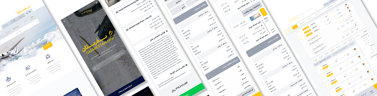
Website · 3 screens
Before → Mid-fi → High Fidelity
Each screen is shown across three states: the original design, the mid-fidelity wireframe that defined the structural changes, and the final high-fidelity redesign.
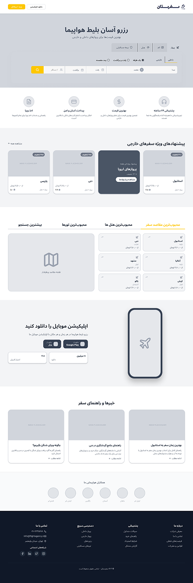
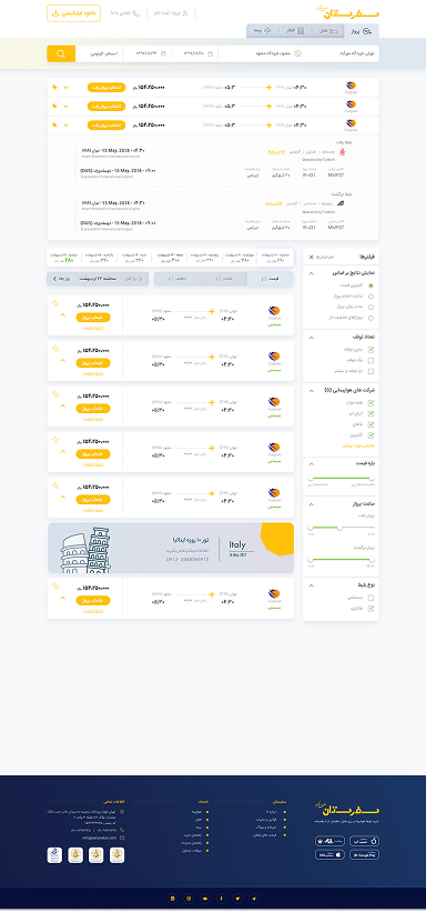
- Before
Issues:
- Heavy yellow hero overwhelms the fold
- Critical search function buried below decorative typography
- Flat tabs lack hierarchy—users hunt for booking options
- Cluttered layout fights for attention instead of guiding it
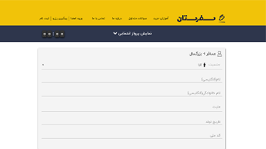
- Mid Fidelity
Structure:
- Search-first architecture: Elevated to top of visual hierarchy
- Z-pattern flow: Search → Categories → Deals → Map → App → Proof
- 12-column grid establishes consistent proportions for responsive scaling
- Content chunking separates functions into scannable card blocks
- High Fidelity
Result:
- Aspirational sky imagery supports brand without obscuring functionality
- High-contrast yellow CTA dominates hero; tabs gain clear active states
- Clean horizontal grid for destinations enables instant price comparison
- Trust signals (airline badges, interactive map) added to footer
- Light palette reduces cognitive load while maintaining local market warmth
Screen 02
Search Results
- Before
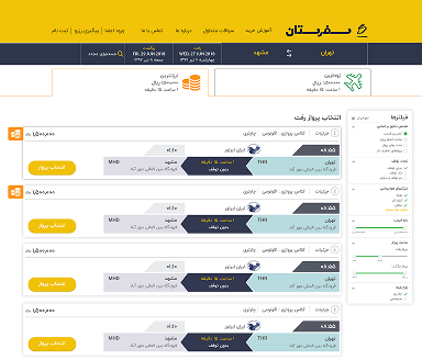
Issues:
- PowerPoint-style arrow graphics create heavy visual noise
- No price calendar forces users to click through dates blindly
- Filters buried or missing—no sidebar hierarchy
- Cluttered timeline layout fights scanning; poor information density
- Mid Fidelity
Structure:
- Card-based architecture: Replaced arrows with clean horizontal flight/tour cards
- Right-sidebar filtering: Dedicated space for airlines, stops, and price ranges
- Price calendar integration: Weekly fare grid above results for quick date comparison
- F-pattern layout: Search summary → Filters → Scannable list → Pagination
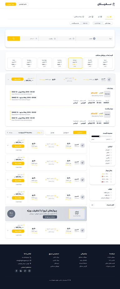
- High Fidelity
Result:
- Removed decorative arrows; yellow reserved exclusively for price/CTA highlights
- Clear typographic hierarchy: Airline → Route → Time → Price → Action
- Interactive filter chips and collapsible sidebar reduce cognitive load
- Generous white space between cards enables rapid scanning of options
Screen 03
Passenger Information
- Before
Issues:
- Hidden dropdown for ticket selection—users must toggle to see details, then close to type
- Dense, plain form fields lack visual breathing room or progress indication
- No sticky summary; users lose context while scrolling lengthy inputs
- Mid Fidelity
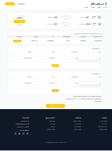
Structure:
- Persistent ticket card: Locked flight details at top—always visible, never blocking forms
- Sectioned form flow: Personal info → Contact → Documents, separated by clear headers
- Two-column grid for related fields (name/surname) reduces vertical scroll
- Validation states mapped to prevent error overload
- High Fidelity
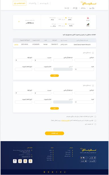
Result:
- Clean, airy input fields with consistent Persian typography and ample padding
- Sticky price summary with airline branding maintains booking context throughout
- Step-wise visual progression (Passenger 1, Passenger 2) clarifies multi-traveler entry
- Secondary actions (add passenger, apply discount) visually subordinated to primary CTA
Mobile App · High Fidelity
The app redesign went straight to hi-fi — covering the full product flow. The complete interactive prototype is the primary deliverable for the app.
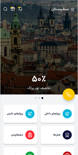
Homepage app
Simple options for users to select between flight, hotel, tour, insurance, or directly contact the agency, along with notifications, gifts, and more.
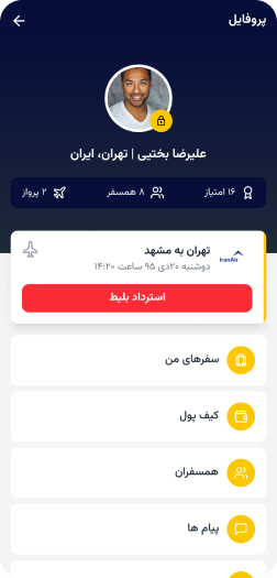
Profile & Wallet
Profile section to manage tickets and track flights, with easy access to past trips, travel companions, notifications, and wallet.
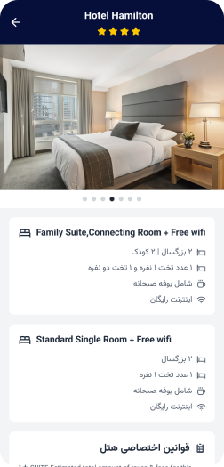
Hotel details
Information about the selected hotel, including room details, amenities, specific policies, and accompanying images.
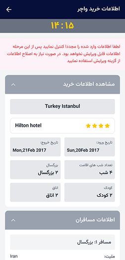
Review page
Review page featuring a countdown timer before completing the purchase, displaying detailed information about the hotel, passengers, and policies.
Interactive Figma prototype
Full high-fidelity prototype with all transitions, micro-interactions, and the preview of different section, booking flight, booking hotel, different sections of the profile, login page or guest account.
Phase 4
Usability Testing
More than 15 usability testing sessions were conducted during the design process to collect feedback and uncover friction points.
Testing sessions
Moderated usability tests conducted across the design process with a mix of novice and experienced travellers.
Accessibility review
Accessibility evaluation performed to ensure alignment with Web Content Accessibility Guidelines — more inclusive for users with disabilities.
Design refinement
Insights from user feedback and data used to continuously refine the interface — improving usability, accessibility, and conversion performance.
Key usability issues found & resolved
Filter panel was not discoverable
Users on the results page often missed the filter controls entirely, leading to scroll fatigue and drop-off. Fix: Moved filter panel to persistent left sidebar on desktop; added a prominent "Filter" chip bar on mobile.
Payment page caused anxiety for older users
Mohammad Reza persona type users expressed stress about payment security and couldn't find cancellation policy. Fix: Added secure payment badge, total price breakdown, and inline cancellation policy before the CTA.
Booking progress was unclear
Users couldn't tell how many steps remained in the booking flow and felt uncertain about committing. Fix: Introduced a 3-step progress indicator (Details → Payment → Confirmation) persistent across all booking screens.
Visual Design Felt Heavy and Uninviting
The mobile layout relied too heavily on solid yellow backgrounds, creating a visually dense interface. Large white spaces and strong color blocks made the design feel unbalanced.
Phase 5
Post-launch
Design system
Design System Development
After launch, the design system was extended and handed off to the development team — ensuring long-term consistency as the platform scales.
What was delivered
Complete Sketch component library with auto-layout, token documentation, responsive grid specs, and dark/light mode variants. All components annotated for developer handoff with interaction states and spacing rules.
Impact on team workflow
Reduced design-to-development friction significantly. Developers could implement new features using documented patterns without design review for each screen — speeding up sprint velocity.
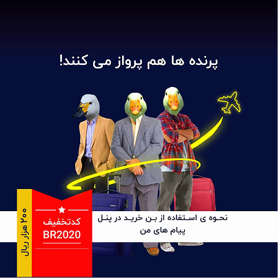
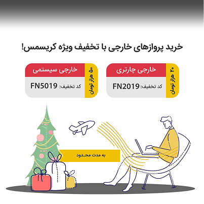
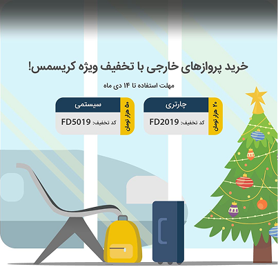
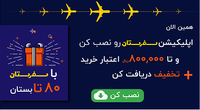
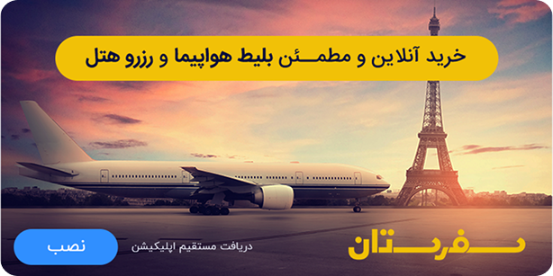
Marketing
Social post, story, banners, video
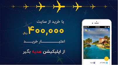
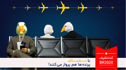
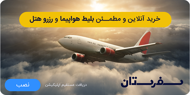
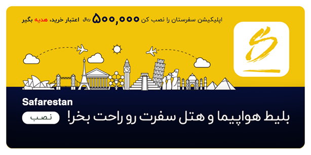
During the project, marketing materials were designed to expand the Safarestan visual language into Iranian advertising channels — including in-app banners, loading and pop-up promotions, third-party publisher placements (Sepehr, Mowj, Namasha), and the SibApp (Iranian Appstore) marketplace.
App Banners
Loading and pop-up banners
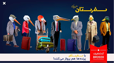

Banners


SibApp banner (Iranian Appstore)

Phase 6
Results & Impact
More than 15 usability testing sessions were conducted during the design process to collect feedback and uncover friction points.
Annual Visits
Platform attracts over 2 million users annually following the redesign launch
Leading marketplace
Safarestan became one of the leading online travel marketplaces in Iran post-launch
Usability sessions
Sessions conducted during design process — iterative improvements at every stage
Key takeaways
The power of user research
Investing in thorough user research early — even without access to internal data — was crucial. Competitive analysis and public sources were sufficient to surface the critical friction points that shaped the entire redesign.
Collaboration is key
Close collaboration between designers and developers throughout the project was essential. Bringing engineering constraints into the design process early prevented rework and ensured practical, implementable solutions.


